

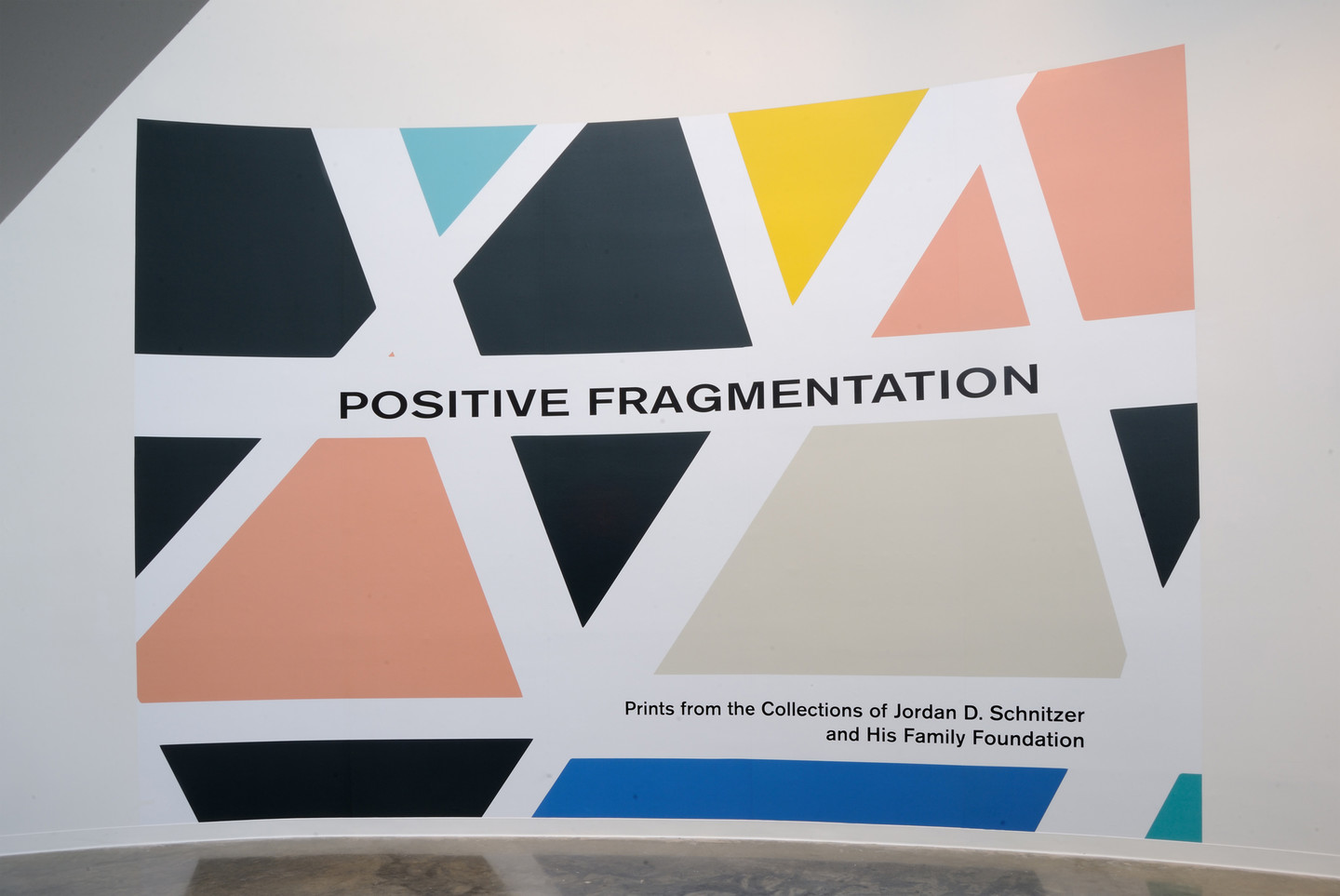
Several of the artists featured in Positive Fragmentation: From the Collections of Jordan D. Schnitzer and His Family Foundation discuss their inspirations, materials, and processes.
Curator’s Introduction
Ginny Treanor, NMWA associate curator
Ginny Treanor introduces the exhibition, and discusses the theme of fragmentation found throughout the works.
Hello and welcome to Positive Fragmentation: From the Collections of Jordan D. Schnitzer and His Family Foundation. I’m Ginny Treanor, Associate Curator at the National Museum of Women in the Arts in Washington, D.C. This exhibition is a three-way collaboration between the National Museum of Women in the Arts, Jordan Schnitzer and His Family Foundation, and the American University Art Museum, which has so graciously invited us to hold this exhibition in their space while our museum’s historical building undergoes renovations.
All the works in this exhibition come from the Schnitzer collection, one of the largest private collections of contemporary prints and multiples in the world. Schnitzer’s holdings boast a large percentage of work by women and non-binary artists. Taking these rich holdings as a starting point, I was struck by how many artists used pieces or fragments of things in their work.
The framework of fragmentation here, specifically positive fragmentation, is a way of understanding creation and meaning through an initial destruction. The destruction in question can take many forms. It can be the disassembling of body parts, the deconstruction of line and color, or the willful taking apart of language. When artists take these dissected elements and rearrange them to form a new whole, an entirely new meaning is created—one that often seeks to uncover that which was obscured by the original unaltered source material.
Christiane Baumgartner
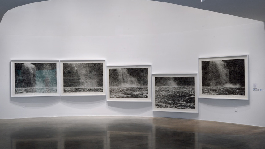
Christiane Baumgartner discusses Stairway to Heaven, 2019
I’m Christiane Baumgartner. Stairway to Heaven are five handmade woodcuts related to each other. They are all cut by hand just with a sharp knife by myself, so it took me several months. And they are printed by hand in my studio with very simple tools using a baren and help by just one assistant. I made this work in 2019 as a commission for the Québec City Biennial Manif d’art, who had invited me to come to Canada for a residency. At this time, I had made just several nature-related works and was attracted to water, to the sheer force of the water. So in Québec, I took many photographs of different waterfalls and went back to one place on different times of the day, sitting there in front of the falling water for hours, listening to the ongoing noise.
Later, back in Leipzig, I decided to concentrate not so much on the falling water but on the horizon itself. For me the horizontal line, the silver line, is very important in this piece, and this is the reason why I hang the works in steps to keep the horizontal line in one line. And this brought me to the title: Stairway to Heaven (Himmelsleiter). It contains for me the horizon, the fixed points we as humans relate to. But in contrary to this, the falling water shows a vertical force that grates in the stone millimeter by millimeter over millions of years. This idea of the infinite, which never ends and is stronger than us, I think that’s wonderful.
Judy Chicago
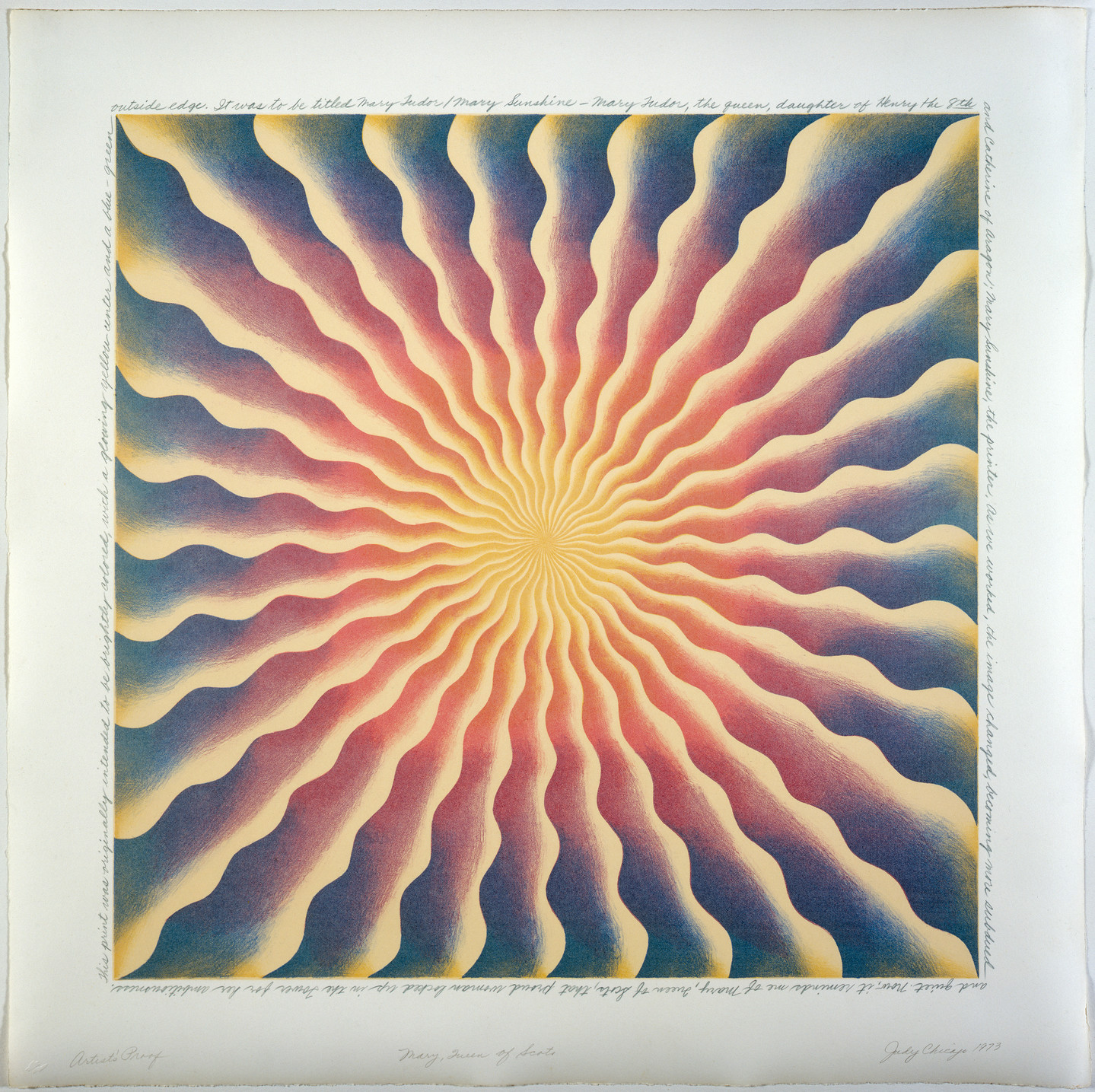
Judy Chicago discusses Mary Queen of Scots, 1973.
Mary Queen of Scots was done at Cirrus Editions in Los Angeles, which was founded by Jean Milant. It’s been going for more than fifty years. In the case of that image, it relates to the Great Ladies paintings that I was doing in the early 1970s, which were my effort to translate my research into women’s history and my discovery about all these important women into images. The print was originally done as a lithograph, but I couldn’t get the color to work in the way I wanted to in terms of the fades, so Jean suggested overlaying a silkscreen on top, a flat, a very thinly inked flat, that subdued the color. And I thought that was very appropriate, especially for Mary Queen of Scots, who as we know was killed by her own sister.
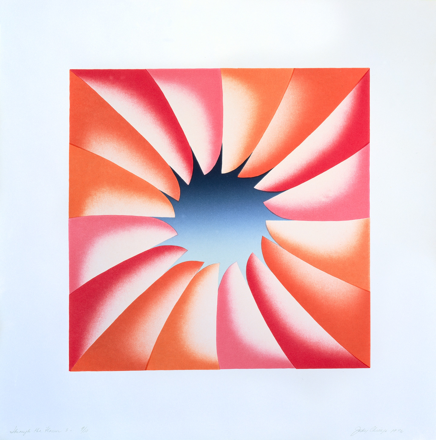
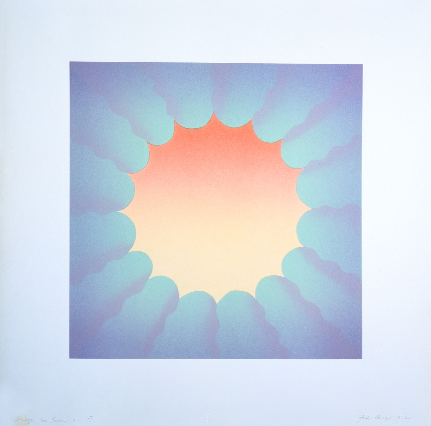
Judy Chicago discusses her print series Through the Flower, 1972.
The Through the Flower prints were done at Tamarind [Institute]. They are lithographs. One of the challenges was that at that time a lot of lithographs were done on stone with a special kind of pencil. But the problem was for me in my work, which involves very delicate fades, the range from dark to light on stone was very limited. Anything lighter than thirty percent or darker than seventy percent on the gray scale would disappear. So in order to do these prints, I ended up spraying what is called tusche, and then I wanted them to be very pale and so I wanted more transparency. The man who ran Tamarind at the time, Clinton Adams, was quite upset with the amount of transparency that I wanted to use. He said the prints would fade, and he was right in terms of the Through the Flower Twice, the diptych; it did fade, but I like the pale quality.
As to the title of these images, they are exactly what they are called: Through the Flower. I was working on images involving trying to move through the limits of the construct of femininity into a larger and freer space. This was the same time in the early 1970s when I started the first feminist art program at Fresno State—now Cal State, Fresno—that I brought to Cal Arts.
Judy Chicago discusses her print archive.
Over the course of my career, I have done more than 100 prints in a range of media. No one was more surprised than I was to realize how many I had done, and I am really thrilled that the Jordan Schnitzer Family Foundation acquired my print archive along with dozens of preparatory drawings that will allow people to understand that the simplicity of my imagery often belies the complexity of the process.
Swoon (Caledonia Curry)
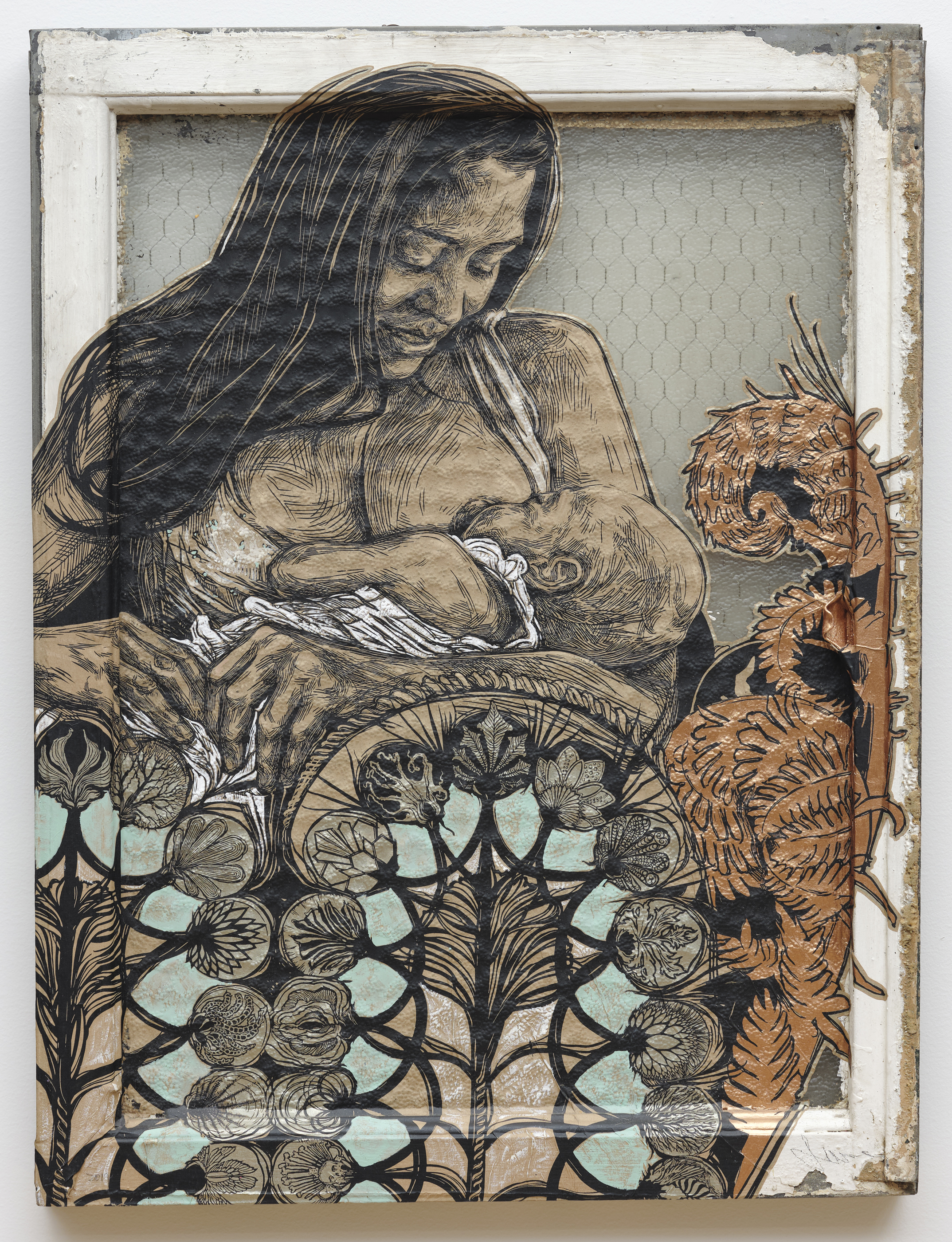
Swoon discusses Dawn and Gemma, 2017.
Hi. My name is Caledonia Curry, and I also go by the artist name Swoon, which was a pen name that I adopted many years ago when I was doing work out on the street. And this piece is entitled Dawn and Gemma. It’s a portrait of a childhood friend of mine with her new baby in her arms, and it went through a few stages to become the piece that you see on the wall. So, its original incarnation is a twelve-foot-high-by-twelve-foot-wide, hand-carved, linoleum block print, and I’ve only made a few of these, like, mega-prints, but this was one of them. And then because as a printmaker I love to make variations and permutations from a single image, I decided to make a version of this which wasn’t twice my height and then some, so I shrunk it down into this little silkscreen print that you see before you. And the silkscreen-on-paper is then cut out and then wheat-pasted onto a found object, in this case a window because I love architecture. I started making these prints as paste-ups for the street, in fact, so the window speaks to that history a bit. And then after pasting it down, I spend some time painting it, you know, choosing colors which suit this particular iteration, and which respond to the colors and textures of the objects it’s pasted to, until I arrive at a new artwork that feels complete.
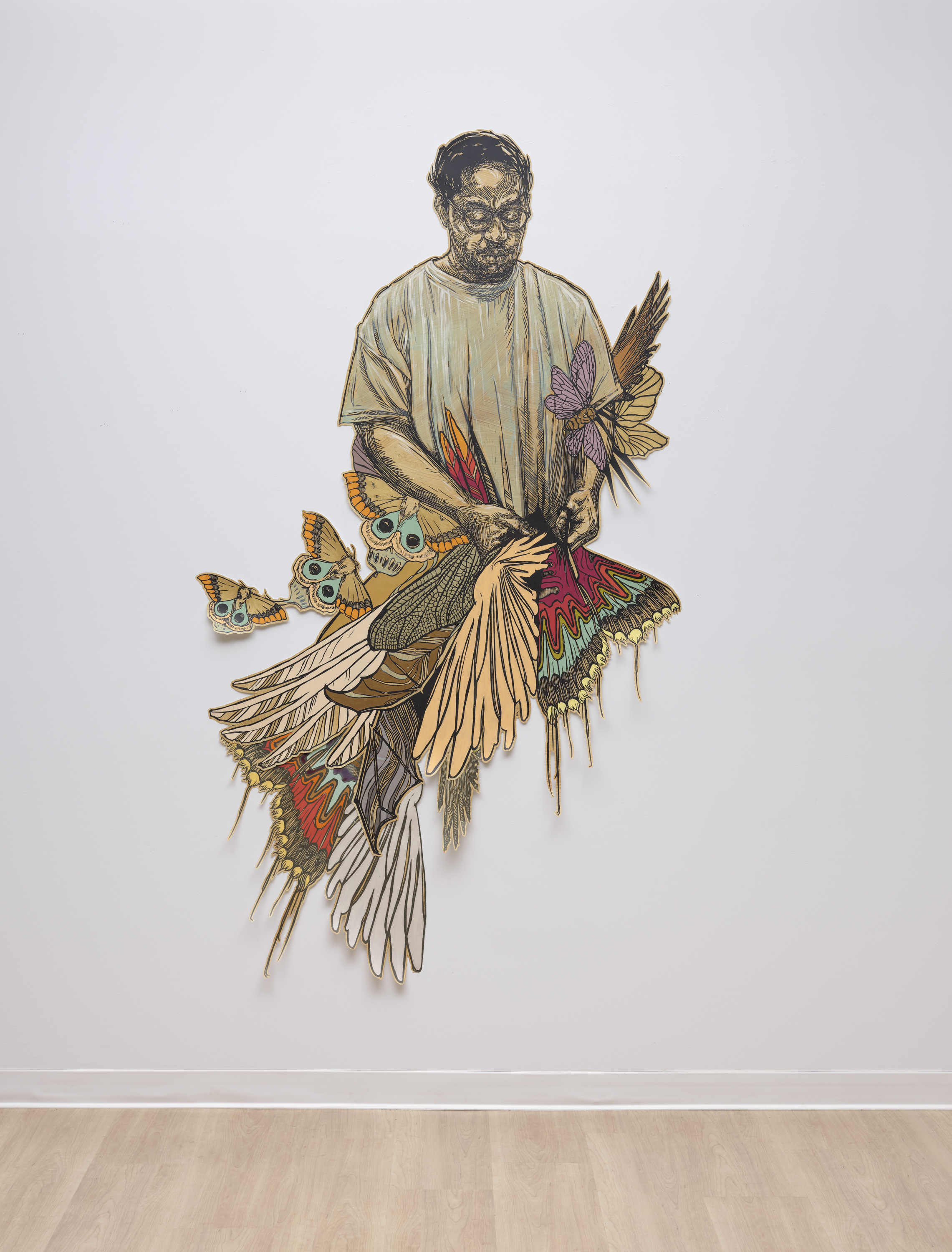
Swoon discusses Yaya, 2016.
Hi. My name is Caledonia Curry, and this block-print portrait is called Yaya. It’s a portrait of a friend of mine, the artist James Hough [pronounced “Hew”] who also goes by the nickname of Yaya. And in the portrait, he’s creating an artwork and also maybe becoming that artwork at the same time. So, I first met Yaya when he was serving a life sentence in Graterford penitentiary for a crime that he committed when he was a teenager, who was self-medicating a lifetime of trauma with drugs and who was in the grips of a PTSD flashback.
And at the time I met him he was now nearly fifty, and you know, he’d read and could quote from every book imaginable, he was this incredible artist, and also a really compassionate leader to his fellow inmates. And I knew then, as did the Restorative Justice program I was working with at Philadelphia Mural Arts, that this person bore little relationship to that once-violent teenager, and that jailing minors for life is just not a humane practice. And the laws around life sentences for minors have since been changed, thanks to the tireless work of many, including James and Philadelphia Mural Arts, and he’s now an artist who travels the country and who teaches others about healing trauma through his own experiences.
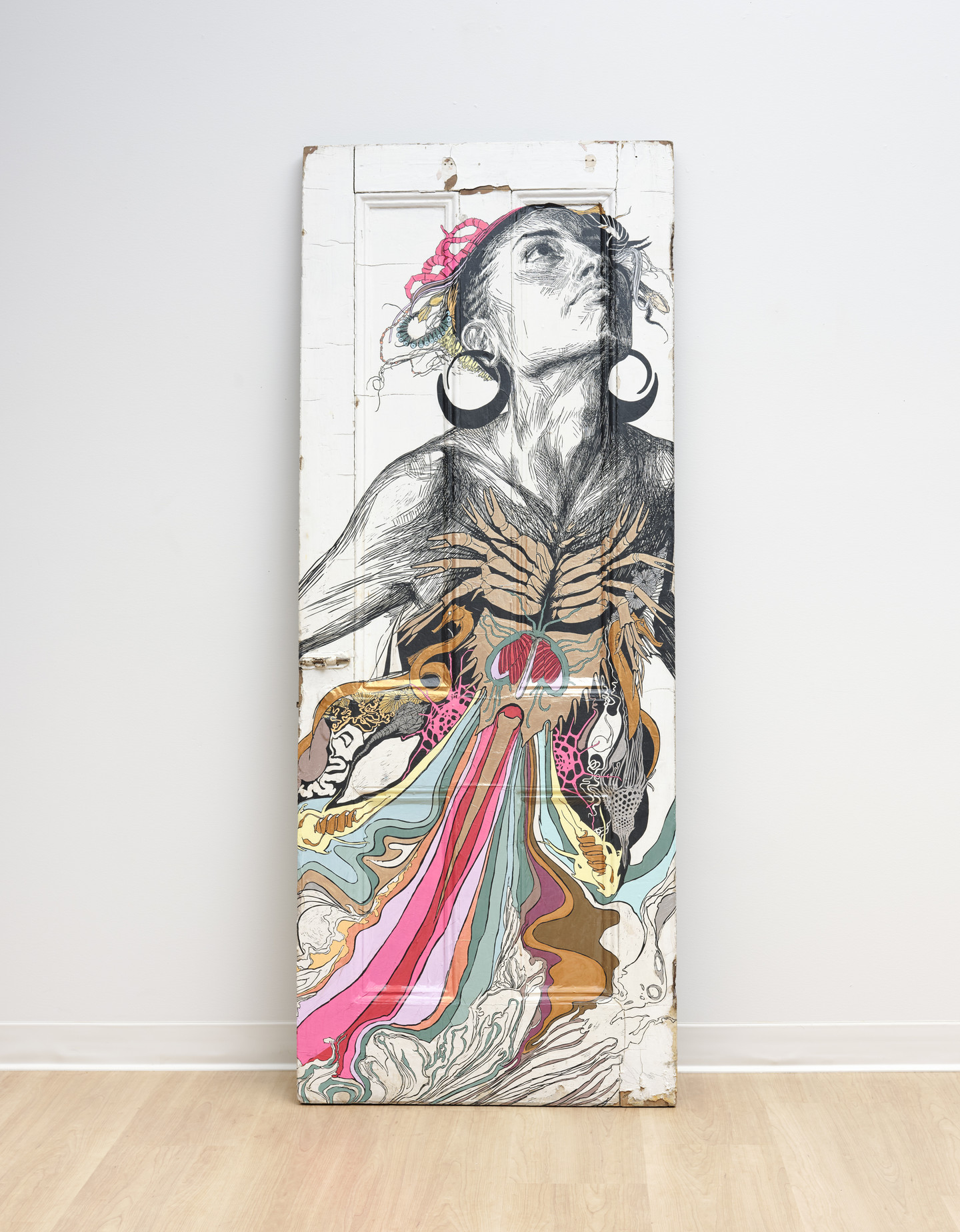
Swoon discusses Thalassa, 2020.
Hello. My name is Caledonia Curry, and I also go by the artist name Swoon because I started wheat-pasting portraits out on the street many years ago, and the name stuck. So, this piece is called Thalassa, and it’s named for a Greek primordial incarnation of the sea. And as I drew this piece, I was thinking about humanity’s relationship to the sea and also my own relationship to water, because I was at that moment in a state of grief and shock over the BP oil spill that had happened in the Gulf of Mexico in 2010, near my home state of Florida. And so much life was lost and there was such a feeling of helplessness. But eventually I found the thing that I wanted to draw was the place inside each of us where the sea is our mother. And in some ways I feel the freest when I’m in water, and so that spirit is really alive inside this portrait as well.
The model of this portrait is my dear friend, the poet Naima Penniman, and the original block print from which this scaled-down version was created is almost fifteen feet high. It was the biggest block print I’d ever made, and it took hundreds of hours to carve. You know, but I’d say whoever you are, Thalassa is the part of you that knows deep down that what you really are is the crest of a wave, which is also inseparable from the infinite sea.
Nicola López
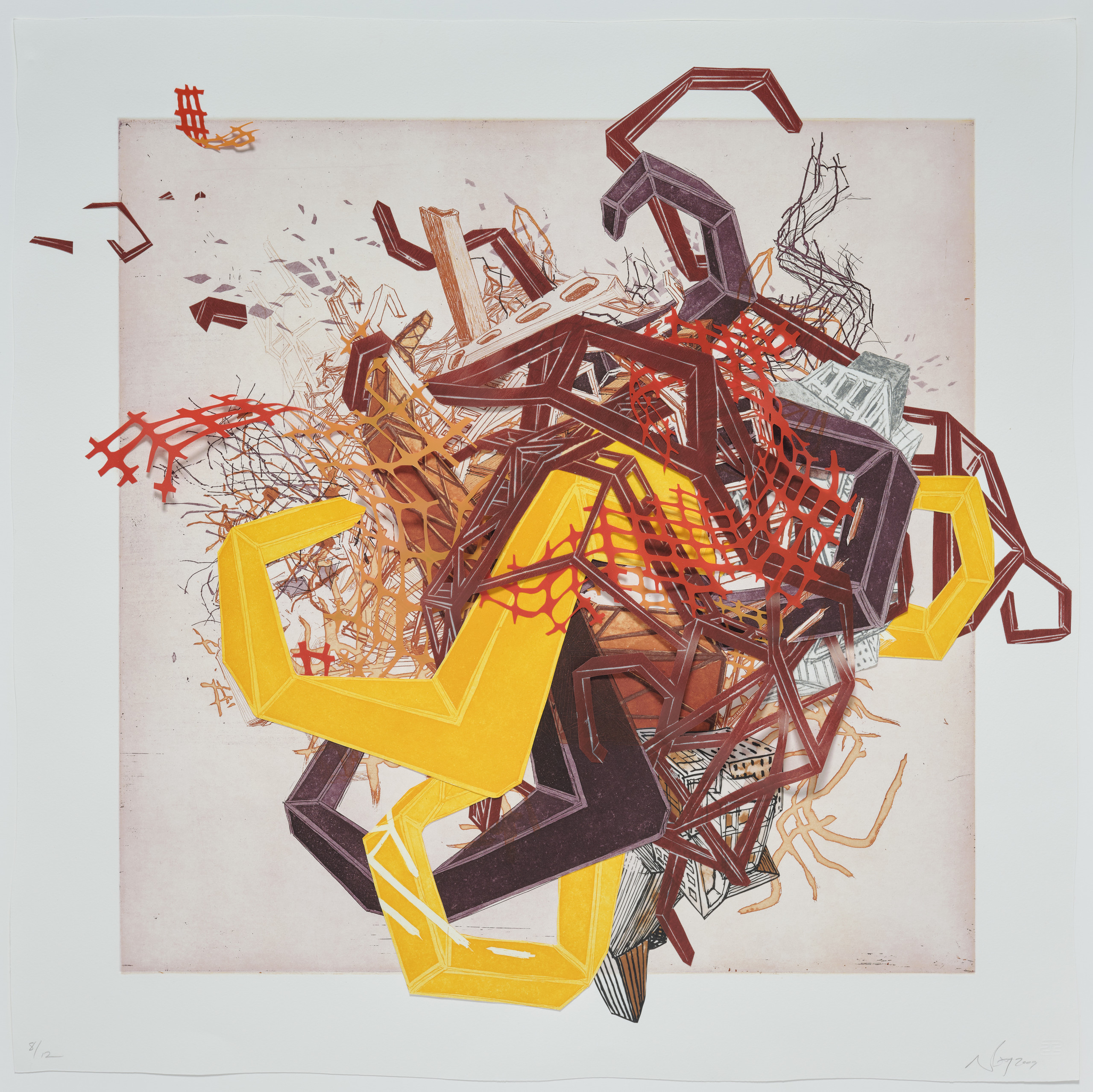
Nicola López discusses her print series Urban Transformation, 2009.
With Urban Transformation, I started as I often do with a general idea of the pieces that I wanted to work with, a general idea of the visual elements, but without a fixed vision of what the final pieces would be like exactly. I drew and then eventually printed out and cut a number of different technological pieces: little cables and pieces of fencing, bolts, nuts, cords, hooks, all sorts of different kinds of detritus, technological detritus. In the end, I had these piles of different printed and cut-out elements—and then I got to play with them. And with the Urban Transformation series what happened was that all the elements eventually got put back together in what ended up being six very unique improvised collages.
Barbara Takenaga
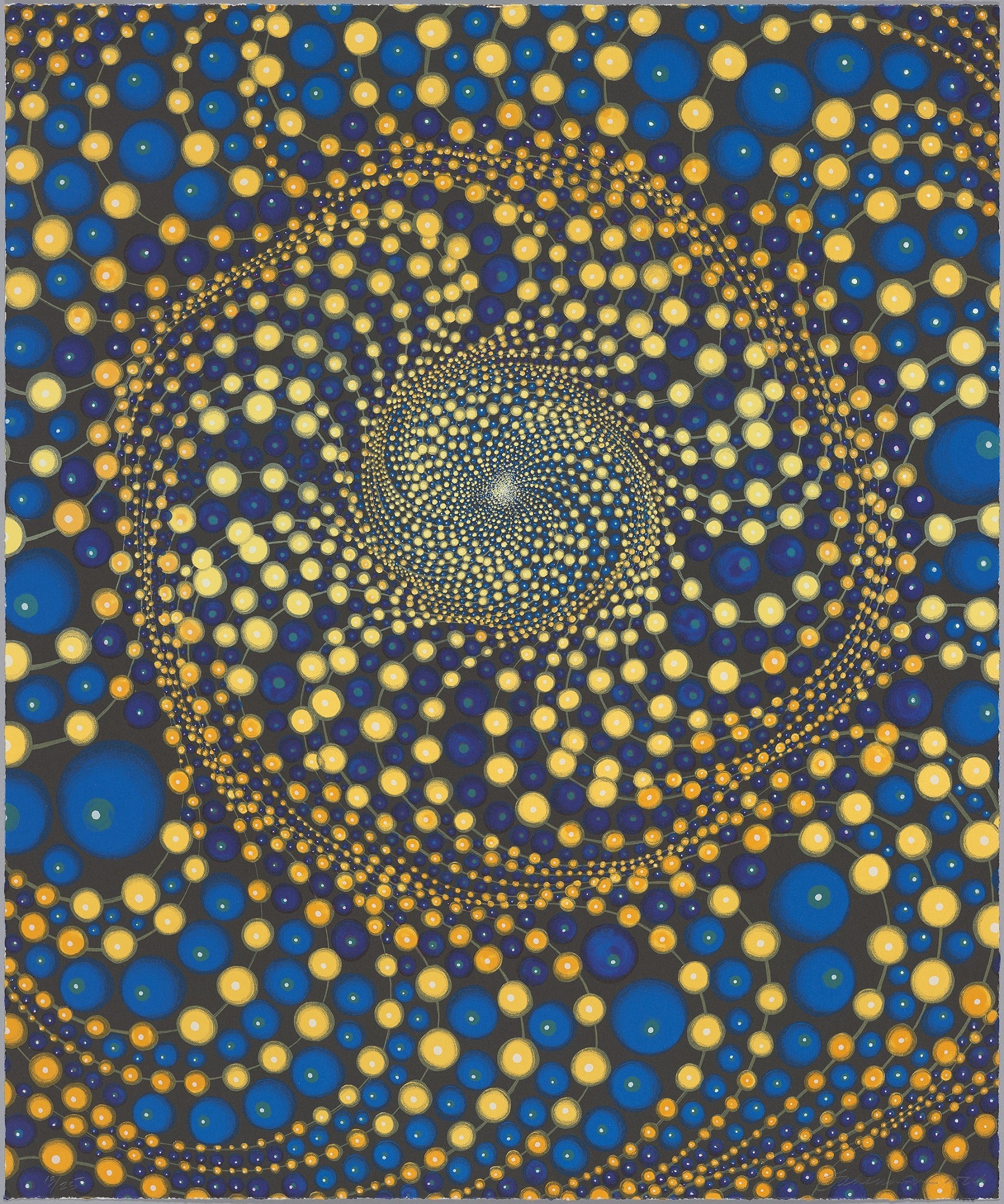
Barbara Takenaga discusses her printmaking process.
Hello. My name is Barbara Takenaga. I have a series of prints in this wonderful exhibition. They were all printed at Shark’s Ink in Lyons, Colorado, where I’ve worked with Bud Shark, the master printer, for many years.
Although I’m primarily a painter now, I got my MFA at the University of Colorado way back in the day in printmaking, and I’ve always loved prints. I like how the process is so primary, paramount really, and that there are certain rules you have to follow as well as kind of pushing against the rules when you can. I also like the fact that prints are very democratic in a way, that they are not outrageously expensive, that many people can enjoy one image. And it also reflects a lot about the way our society deals with multiples.
Related Content
What’s On
