
Her vision is to “move beyond the construct of femininity into the un-gendered and free space that should be available for every human being”; her means of achieving it is art. The first to describe feminist art as its own genre, Judy Chicago’s work relied on what she termed “male drag” in her youth, painting only “macho” themes, to the exploration of the strength of her femininity. She has since created a large body of work that fuses the constructions of masculine and feminine thought, allowing her to transcend the boundaries of both.

Growing up in LA in the 1960s, Chicago found the art world dominated by men. To create her artwork, she attended auto-body school, studied pyrotechnics, and built minimalist pieces with materials like fiberglass and resin. She also contributed to the “Los Angeles Look” genre, whose style was based on the popular practice of spray-painting cars and surfboards. By the 1970s, Chicago was embracing her gender, encouraged by the feminist movement. She began by changing her birth surname, Cohen, to a chosen name, Chicago, as a means of disconnecting herself from patriarchal conventions, like naming. Additionally, she began to make feminist art.
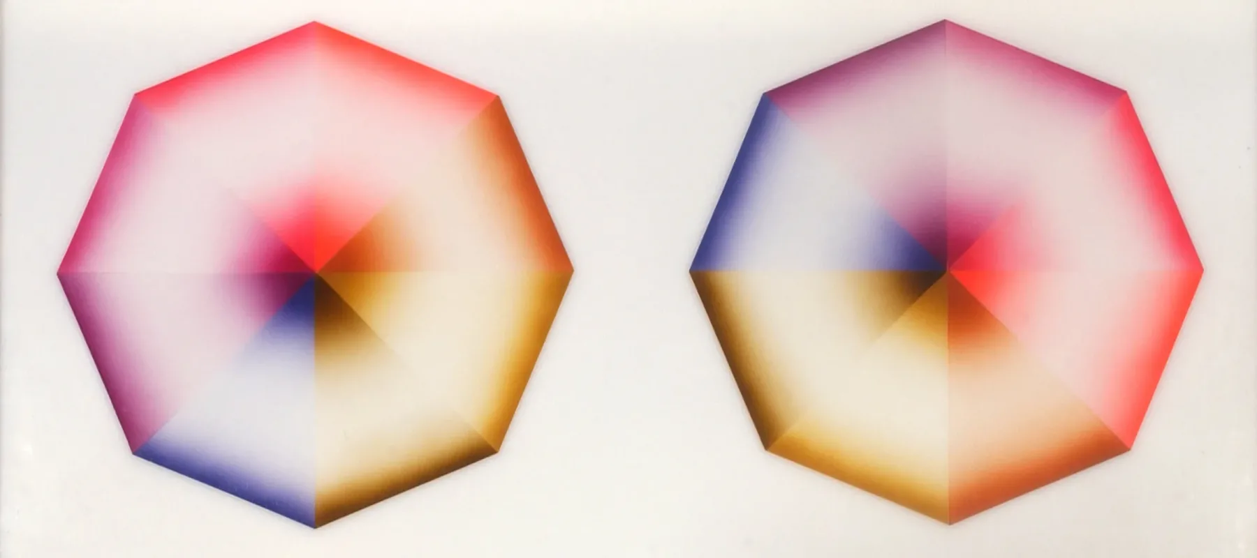
Pasadena Lifesavers, a series crafted in the early ’70s, expresses Chicago’s break with the masculinized notion of power. Chicago’s mission in both Pasadena Lifesaver Red #4 and Pasadena Lifesaver Red #5, on display in NMWA, was to show that the female body is “multi-orgasmic” and not confined to one gender stereotype. Each abstract painting includes four “lifesavers,” whose geometry and airbrushed medium invoke masculinity, while the symbolism incorporated is feminine. For example, the “masculinized” hard edges of the equilateral triangles actually join together to form a patchwork quilt of colors, linking them to the traditionally female occupation of needlework.

Chicago further explores this juxtaposition by incorporating the theme of transition. In Red #5, the colors are so light that they appear like gloss on a candy, representing sensuality as a taste that is constantly evolving. The way the colors fade into each other adds movement, as does the imagery of the forms as spinning wheels. Additionally, she highlights contrasts. Red #5 pins stability against entrancement—the forms are at once closed and dangerous, a recipe that lures the eye as would a poisonous flower. The opposite phenomenon occurs in Red #4, whose forms are bright in color, yet fragile in the nature of their frames. Most remarkably, Red #4’s defined sections of color trick the eye into seeing a white square in the center of the canvas. Chicago’s multi-layered forms raise questions related to viewers’ power over their optical illusions.